
Playing with Pixels
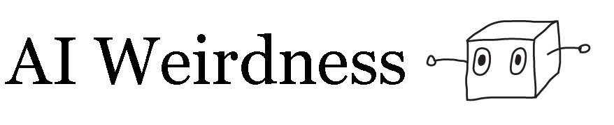
Here's "Ice Cream Planet Swirl", as generated by Pixray.
Pixray uses CLIP, which OpenAI trained on a bunch of internet photos and associated text. CLIP acts as a judge, telling Pixray how much its images look like the text it's trying to match, and it's up to Pixray to figure out how to improve its images to increase its score.
Lots of image-generating algorithms I've used lately work like this. What's fun about Pixray (which is itself based on some of those) is that Tom White gives it a very limited number of pixels and colors to work with.
A fun recent twist on Pixray is Pixray Swirl by altsoph. It makes an animation by taking an image, zooming/moving/rotating it, blurring the image, and then telling Pixray to optimize the image again to match the prompt. With the default settings I made the fun ice cream animation above, and also this animation of "Smoke Swirling from Victorian Chimneys".
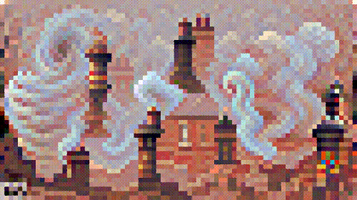
The problem here is that the "swirl" math is not governed by any sense of what should and should not be swirling and rising through the town. It gives the entire picture a twirl, and CLIP is only using its internet knowledge to improve the appearance of the already-twirled image.
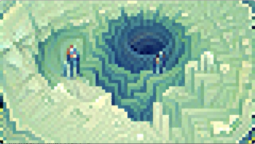
I realized that a selective swirl wasn't going to happen with this algorithm. But zooming in on a photo should apply about equally to everything in it, so I decided to try a landscape. I played with some variations on a theme, and "Straight trail leading past a jelly landscape with jello mountains" gave me a landscape stretching away down a long straight road.
I turned off swirl and translate, set zoom to 20, and got this.
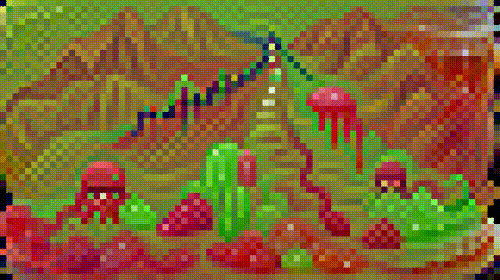
Aside from the apparent multiple interpretations of "jelly" (jelly molds, jellyfish, and a giant looming jar), the main surprise is when the camera immediately jumps off the road and heads for the hills, because apparently I hadn't set the zoom point correctly. Something that zoomed in based on what was in the picture might have stayed on the road. This simple calculation did not.
I gave up on landscapes with roads, and managed to steer the view vaguely toward the center. Here's "The misty volcanoes of dinosaur country."
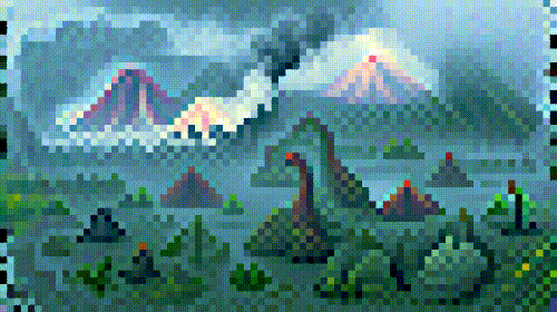
I thought it did a good job, although it does seem to struggle with the size scales of dinosaurs and mountains. And if there are no dinosaurs in the current view, it makes do by reshaping a volcano. In fact, volcanoes often transform into foreground objects like dinosaurs or mist or little triangle-shaped bushes when they move into the lower third of the image. Continuity with the previous image isn't the point - it's trying to maximize how much each individual frame looks like a classic landscape.
Another thing you may notice is that as a dinosaur starts to leave the field of view, it sort of leans into the frame as it's leaving. This makes sense if you remember that it's generating each frame independently. It has no information that in the previous frame there was a dinosaur on its way off-screen. All it sees are pixels near the edge to enhance and, in its experience, features aren't usually abruptly chopped off the edge of the image.
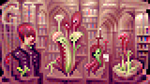
You can really see this effect in one of my favorites, "Apocalyptic landscape by Lisa Frank".
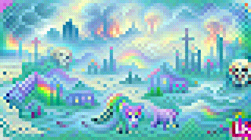
Not only do the animals lean in as they approach the edges of the picture, they also turn and face the camera (and become more skull-like?). Just trying to present the optimal Lisa Frank apocalypse.
Try Pixray or Pixray Swirl! (Click on Open in Colab. To zoom in on the middle of the image in Pixray Swirl, try something like outer_rotation: 0; inner_rotation: 0; zoom: -15; shift_x: -12; shift_y: -6 )
Here's a bonus post in which I attempt to steer the camera down this hole (and a few more holes). For more bonus posts like this, and to get new AI Weirdness posts in your inbox, become an AI Weirdness supporter!