My favorite nonexistent painter
People have noted that when using giant internet-trained AIs like CLIP+VQGAN to generate images, you get much nicer-looking images if you include an artist byline.
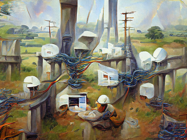
Here's "Internet Infrastructure"
And here's "Internet Infrastructure by J*ames G*urney."
[Edit on Sept 17 2022 to add asterisks in the artist's name to avoid competing with search results for his actual work]
James Gurney, a painter known for works like the Dinotopia books, is particularly prolific online, and people have noticed that adding James Gurney as a byline to an image tends to produce great results. Ryan Moulton's collection of generated James Gurney paintings is astounding.
In general, when it comes to generating images, it pays to know your art history. Here's a thread by hannahjdotca that showcases some of the range that CLIP+VQGAN has picked up from online art.
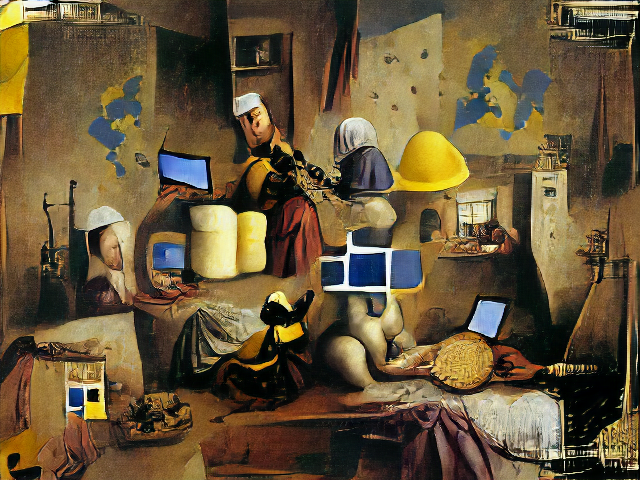
I've found that an artist's period does make a difference - "Internet infrastructure by Vermeer" (1632-1675) is a bit low-tech and hard to parse.
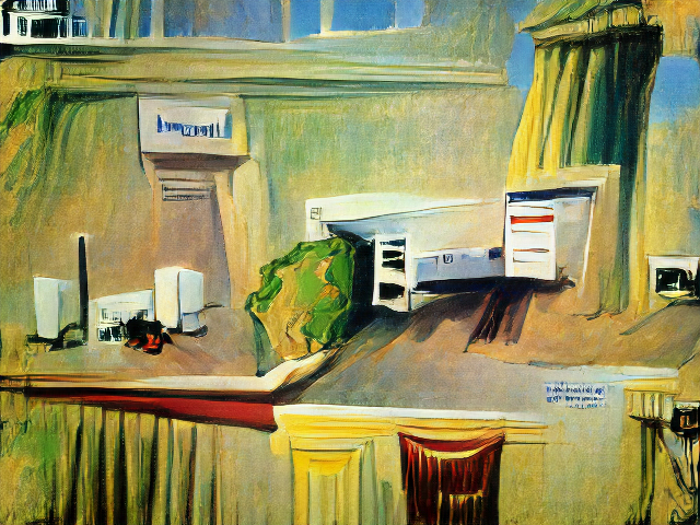
Similarly, "Internet infrastructure by Edward Hopper" (1882-1967) isn't great.
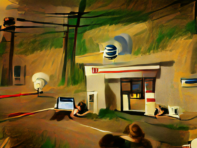
But "Internet infrastructure in the style of Edward Hopper" is much improved (and includes the AT&T logo).
I don't know if asking for an anachronism tends to produce bad results, or if I just picked two artists who don't lend themselves well to buildings and wires.
But I also happened to experiment with made-up artists, and surprisingly they had distinct styles.
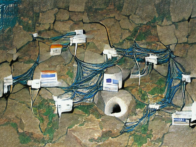
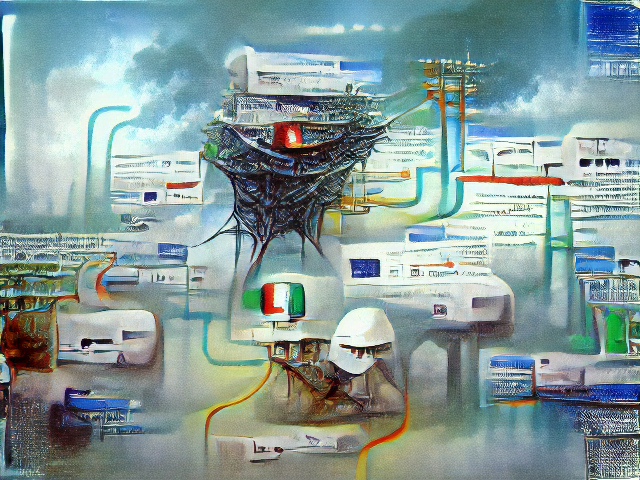
Here's "Internet Infrastructure by Carmine Nottyors".
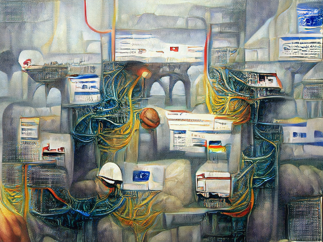
She has never existed. She paints a mean tangle of wires.
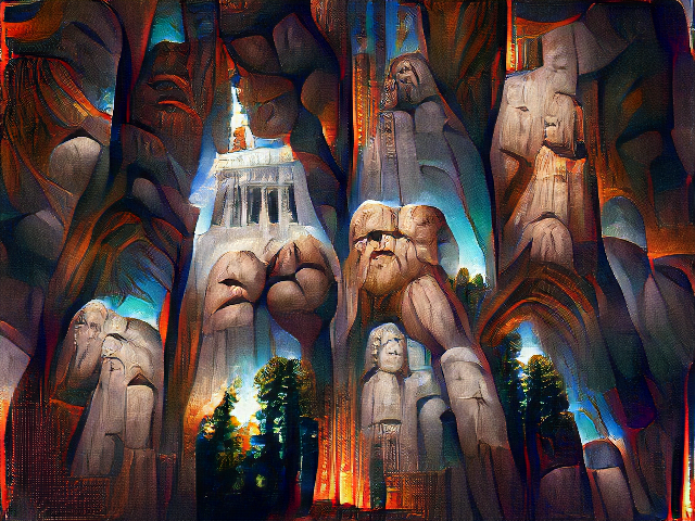
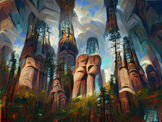
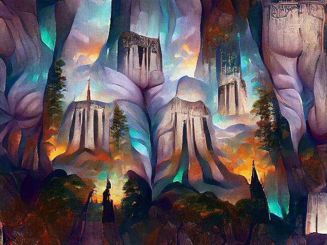
Here's "Cathedral of the giants by Carmine Nottyors".

Her style is distinct from the also made-up Picov Andropov.
And also distinct from the most similarly-named real painter I could find, Toni Carmine Salerno. (Here's "Internet Architecture by Toni Carmine Salerno").
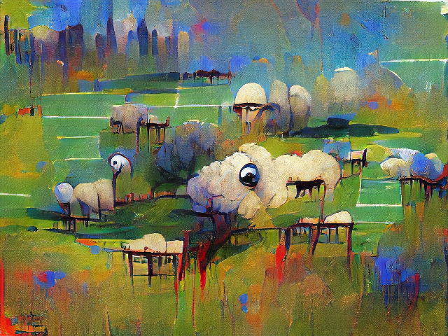
I wondered if it was CLIP+VQGAN's figurative shrug at an unrecognized artist name. But check this out: here's "Sheep in Pasture by Carmine Nottyors".
And here's the clearly-different "Sheep in Pasture by Anonymous" ("Internet Infrastructure by Anonymous" was dominated by white masks)
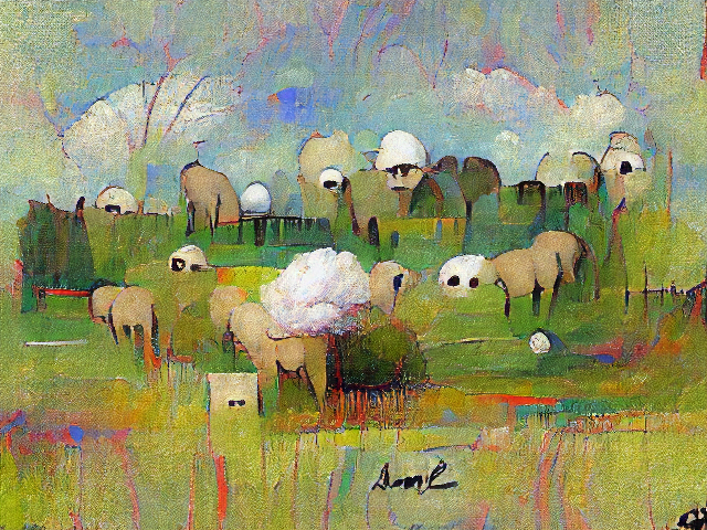
Ironically "Anonymous" is the most prominently-signed painting of all.
I'm intrigued that CLIP+VQGAN can generate unique painting styles for nonexistent artists. It's a dimension of control that I don't think I've seen people exploring yet.
I'm not sure what it means that "Cathedral of Giants by Janelle Shane" looks like Devil's Tower crossed with butts.
For more cool-looking paintings in the style of James Gurney (as well as some hilarious flops), become an AI Weirdness supporter to get bonus content! Or become a free subscriber to get new AI Weirdness posts in your inbox.
